Where creativity unfolds and identities bloom.

Every brand begins as a seed
Scroll to bloom
House of Bloom

A living house where spaces, products and identities unfold together.

Manifesto

House of Bloom was never meant to be a studio.

It began as a response to rushed creation and soulless production. A quiet but radical belief: creation deserves time, and people deserve space.

Born from women, intuition and lives lived between East and West, it is a house in the truest sense: a place that hosts, nurtures and brings ideas to life.

I

Between East & West

Bloom does not fuse cultures for effect; it allows them to converse.

II

Women-led, human-centred

Not loud power, but unshakeable presence.

III

Fun, energy & life

Seriousness and play are not opposites; they are partners.

Now blooming · Current projects

Stories still unfolding.

The florets · Our integrated disciplines

Individually expert. Together, one bloom.

The spadix is composed of many tiny, individual flowers, the perfect metaphor for our five disciplines. Each is a floret on the central spadix, and all of them reach the site through the same stem: our own procurement network.

BLOOM HOUSE OF BLOOM Aeris by Bloom Future chapter Future chapter

The house

A house that gives birth.

House of Bloom

The ecosystem, the home, the platform. A place to return to: not a portfolio, not a brand that performs, but a living house where stories unfold over time.

BLOOM

The creative practice within the house, working across architecture, interiors, spatial strategy, branding and cultural placemaking. Led by an all-female leadership team, BLOOM designs spaces that connect culture, community and commerce.

Aeris by Bloom

An existing curtain company rooted in B2B expertise that evolved by combining its technical knowledge with Bloom’s design intelligence and narrative thinking. Bloom does not replace expertise. It unlocks it.

Sectors

Where we bloom.

Every project belongs to a sector, and every sector is drawn by the same five florets. Choose one to open its projects.

Branding & Identity Division

Brands that live in space.

A logo is easy. A world is hard. Because branding sits inside the same studio that designs the architecture, shapes the interiors and procures every fixture, identity is conceived with the space, never applied to it afterwards. A wordmark becomes a neon sign; a menu texture echoes the wall finish.

Five brands. Five worlds. →
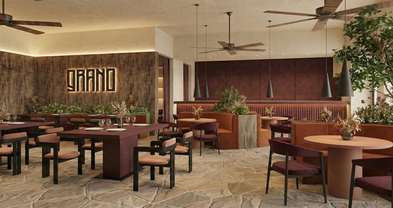
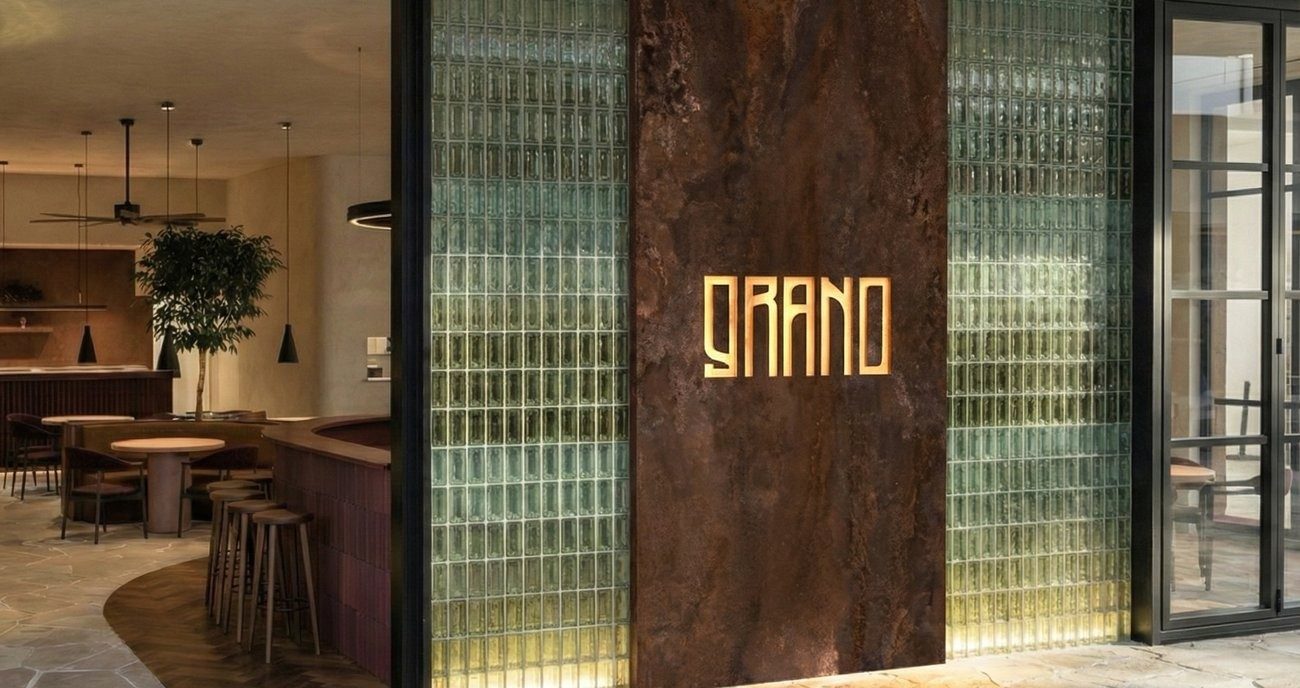
Grano dining room, the wordmark backlit on a timber wall
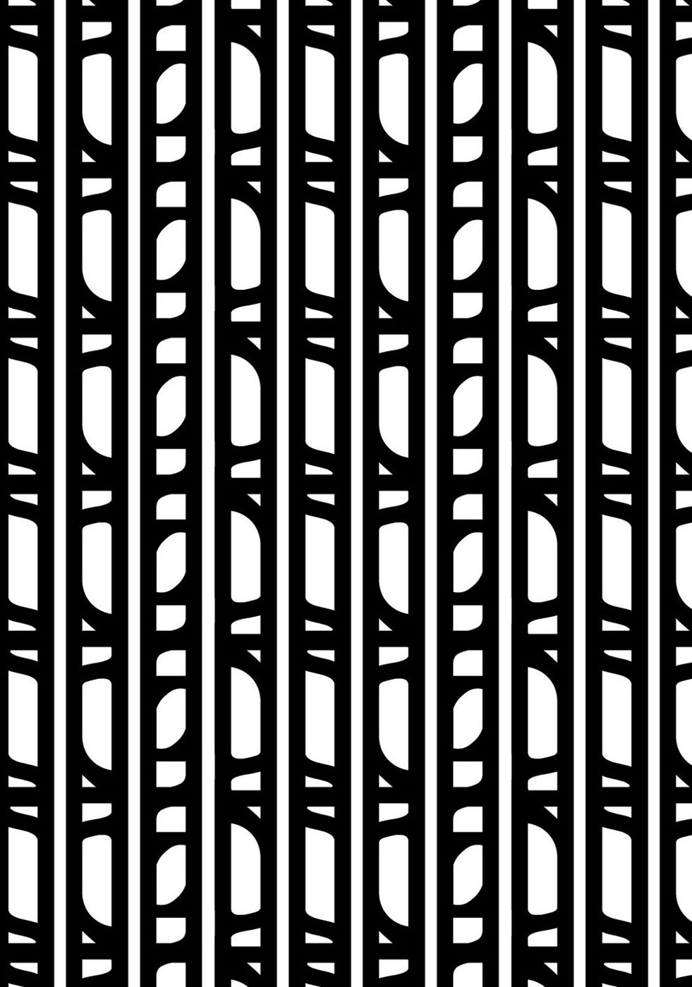
The Grano wordmark cast in bronze between glass block wallsGrano brand relief pattern

01 · Brand platform · Shenzhen, Qianhai

TriArch

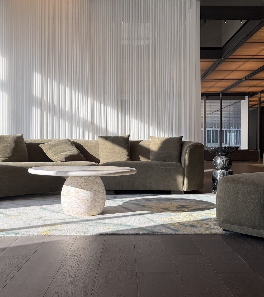
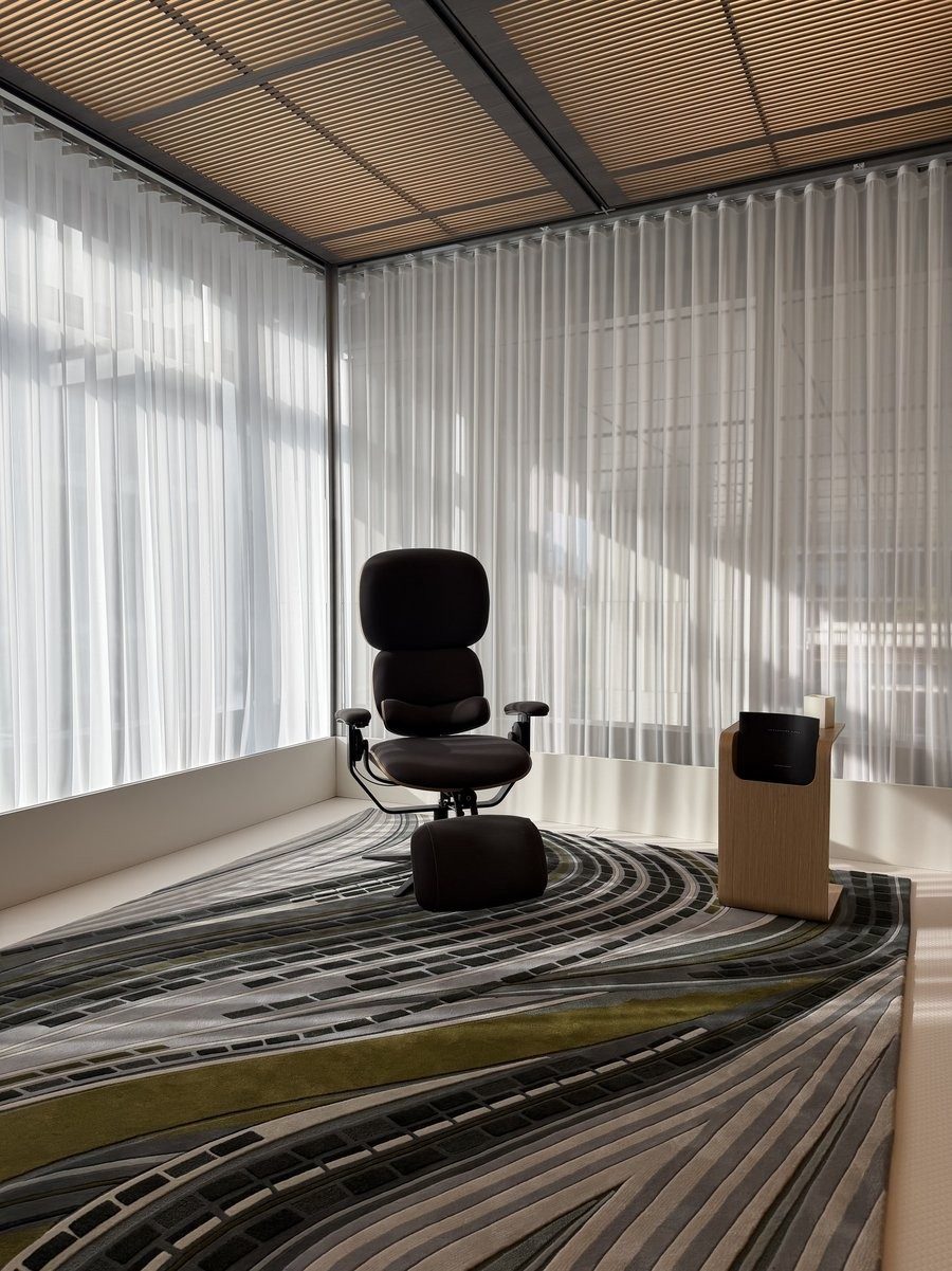
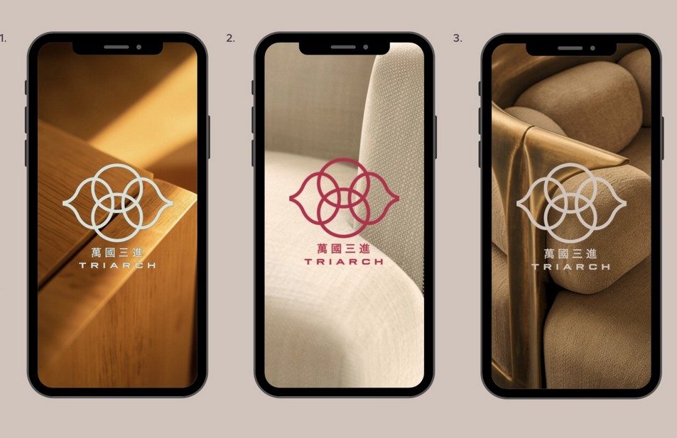
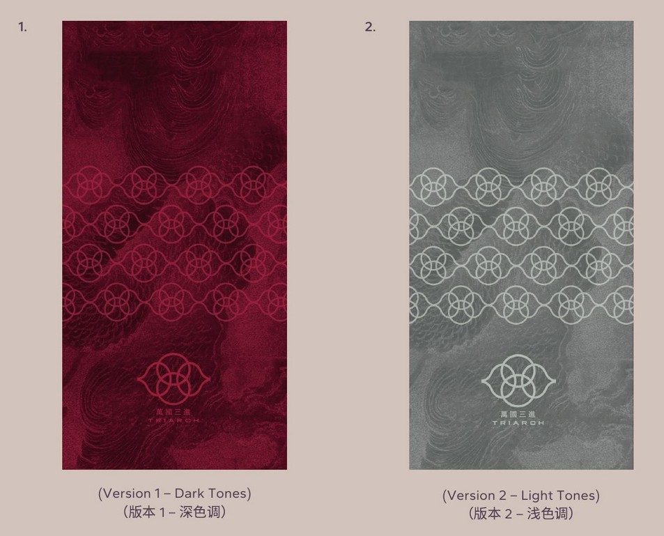
A platform connecting international top-tier brand partners with an invited circle of officials, architects, designers and private clients, across 1,700 sqm in Qianhai. An interlocking-circle marque drawn from Lingnan architecture, its wok-ear walls and Manchurian window lattices, under the idea of elevating heritage through design.

The brand book sets the language; the space speaks it.

TriArch lounge with sheer curtains and a sculptural stone tableTriArch private room with flowing patterned carpet
The TriArch marque on three phone screensTriArch patterned rugs in dark and light tones

02 · B2B curtain systems · Rebrand for luxury hospitality

Aeris

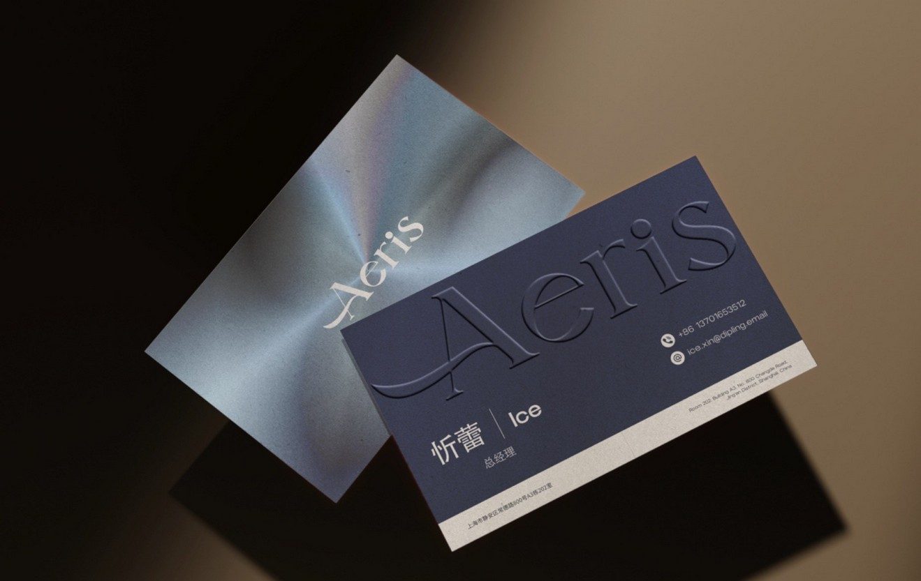
For fifteen years a trusted curtain-systems manufacturer, now rebuilt as Aeris: an identity refined enough to sit at the table with high-end hospitality clients. A high-contrast serif wordmark with a sweeping calligraphic “A”, anchored in deep Chathams Blue and warmed by nutmeg and nude. Aeris designed, produced and installed the curtains for the new Andaz in Shenzhen.

Chathams BlueNutmegNude
The Aeris wordmark
Aeris business cards in Chathams Blue and brushed silver

03 · F&B · Identity, menus & spatial graphics

Grano

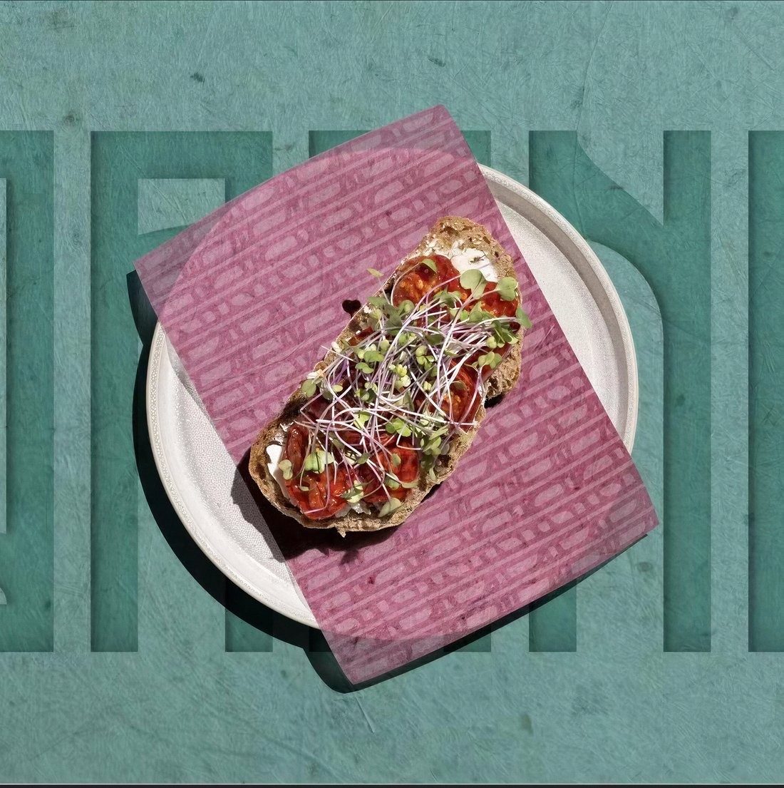
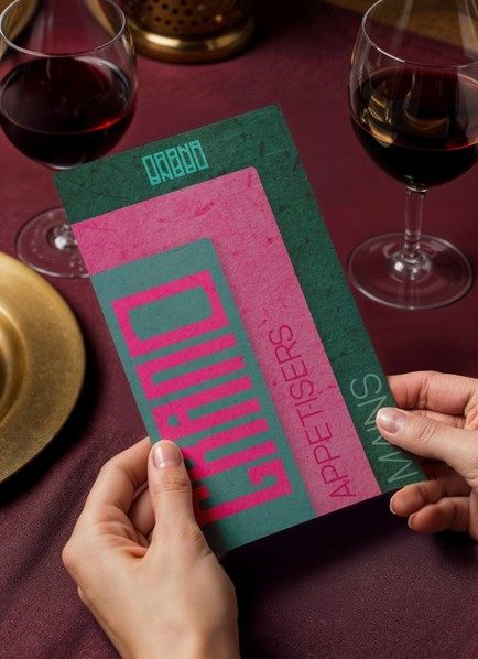
Bakery branding with backbone. A custom stencil-cut wordmark, bold and industrial, lives as comfortably carved into a tabletop as printed on a menu. Deep teal clashes with raspberry pink over raw paper textures; the tables, menus and plating all speak one graphic language.

Inseparable from the space it was made for.

Grano wrapping paper under an open sandwich on tealThe Grano menu held at the table
Grano dining room with the wordmark on the wall

04 · F&B · Identity & packaging

Crudo

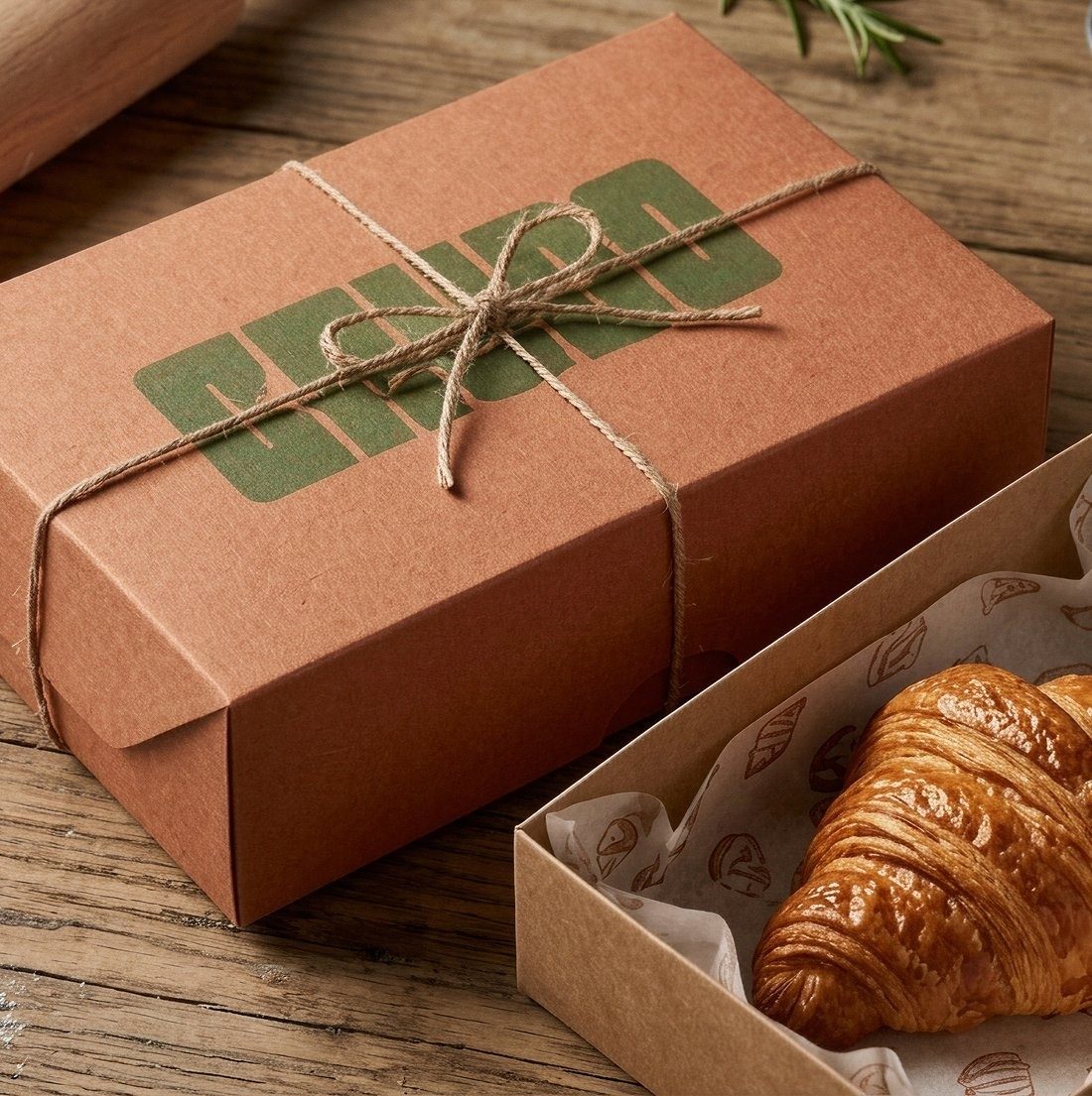
Packaging that behaves like a gift. A chunky, hand-stamped wordmark in olive green on warm kraft board, tied with twine; inside, custom greaseproof paper illustrated with the bakery’s own pastries. Uncoated stock, natural fibre, ink that sits like a stamp: identity you can hold.

Packaging is architecture at hand scale.

Crudo kraft box with olive stamped wordmark, tied with twine, beside a croissant

05 · F&B · Full brand world · Ahangama

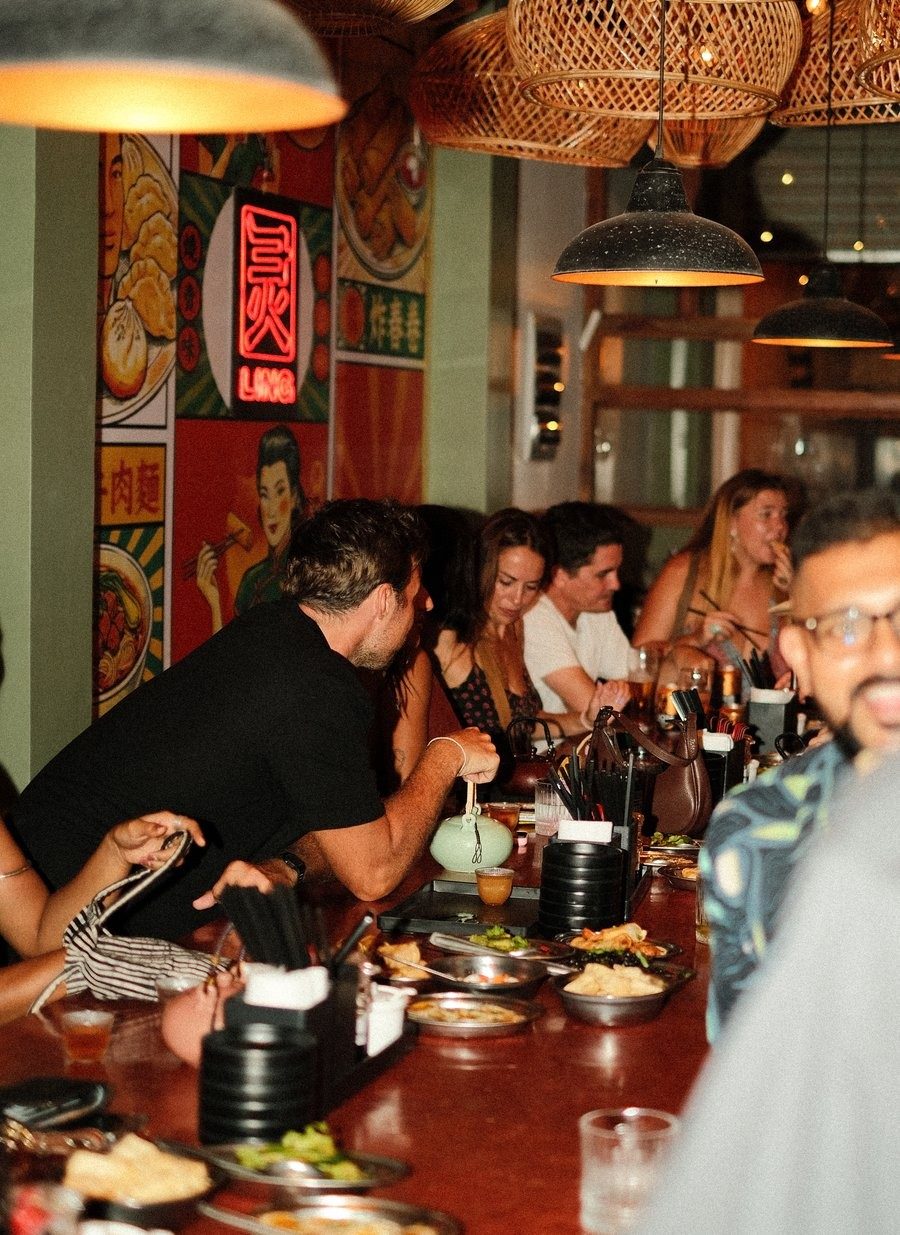
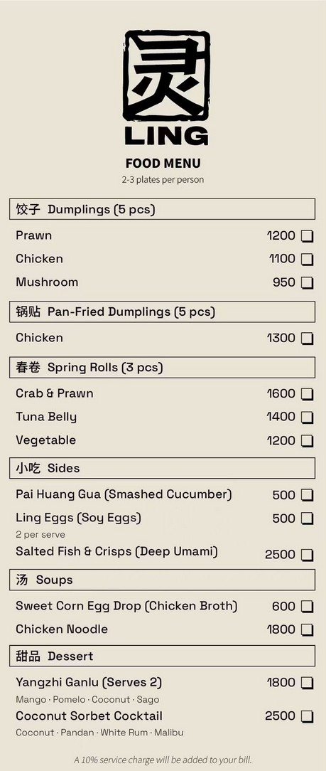
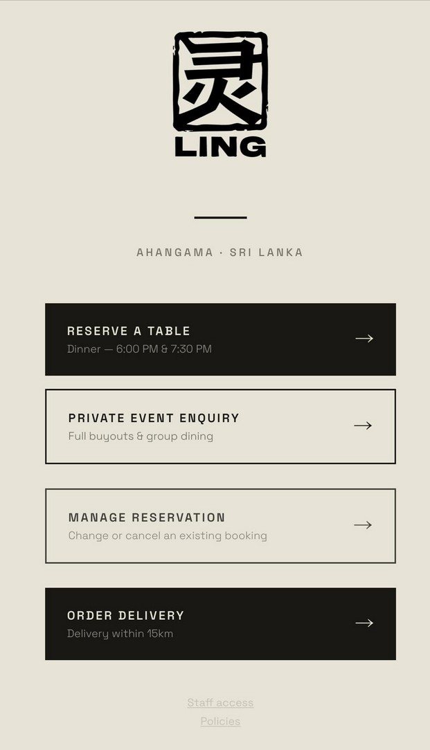
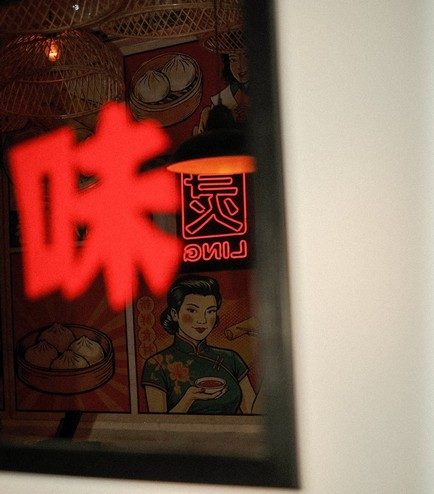
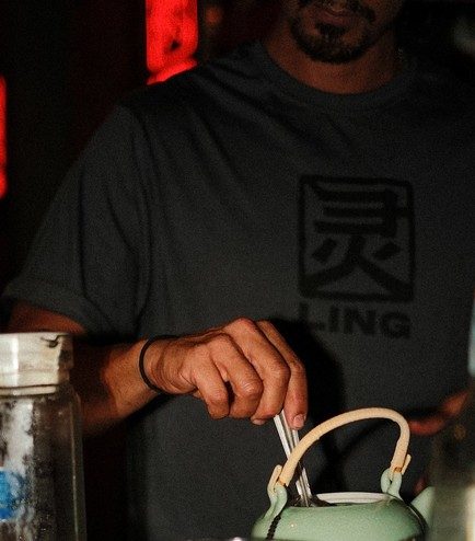
The fullest expression of what we do. A hand-stamped seal, the character for “spirit” as a bold chop mark, expands into an entire world: red neon against retro-inspired murals, rattan light canopies, celadon teaware, staff tees carrying the tonal marque. Menus, reservations, events and delivery online all speak the same graphic language as the neon on the wall.

Interior. Offline. Online. One brand.

A full bar counter at Ling under rattan pendants and red neonThe bilingual Ling food menuThe Ling reservation and delivery page
The Ling seal markRed neon character sign at LingStaff tee with the tonal Ling marque

Rebranding for a new market

The gateway to Greater China.

Entering Greater China is a translation problem of name, nuance and trust. We rebuild international brands for the market they’re stepping into: bilingual identity systems and cultural repositioning that keep their heritage while speaking fluently to a new audience.

KolbiAustralia

Australian brand repositioned for Greater China entry, with identity and market positioning built for a new audience.

David HughUnited Kingdom

British brand guided into the region with a bilingual identity that protects its heritage while opening new doors.

AerisGreater China · B2B

A 15-year curtain-systems specialist elevated to serve high-end hospitality and luxury projects.

From first sketch to final fit-out

“We don’t decorate businesses. We build brands you can walk into.”

Led by Adam Ritchie and Sai van Lierop, the division works through four movements, from insight to installation.

DiscoverDefineDimensionDeliver
  • Brand StrategyInsight, positioning, naming, verbal identity
  • Visual IdentityMarques, typography, colour, guidelines
  • Spatial BrandingSignage, murals, neon, wayfinding
  • Packaging & CollateralBoxes, papers, menus, merchandise
  • Digital & ProductWebsites, apps, UI systems
  • Launch & RolloutSourcing, production oversight, QC
Branding
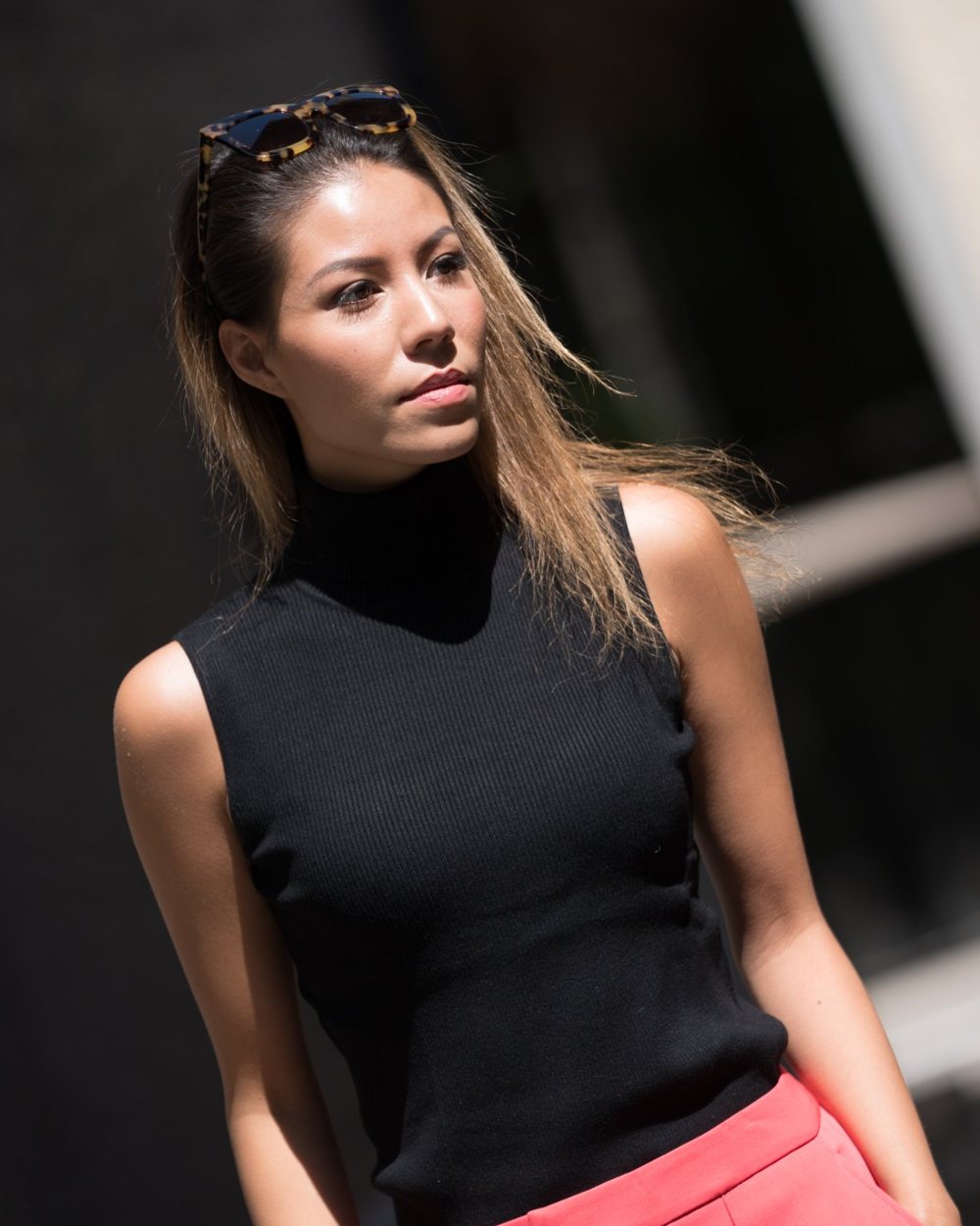
Jovita Lo do Nascimento in a black knit top and coral trousers, standing before an arched wall

Our founder

Jovita Lo do Nascimento

The visionary founder & Creative Director

The creative force behind House of Bloom. With a background that gracefully straddles spatial design, branding and cultural curation, she founded the practice on a singular belief: that design is a powerful, living narrative.

Her journey began not in a single discipline, but in the spaces between them. Under her guidance, House of Bloom operates as a holistic ecosystem where the five florets work in symbiosis.

For Jovita, to design is to cultivate: careful listening, nurturing an initial concept, and allowing it to unfurl into its most authentic and magnificent form.

The people of the house

Working between East and West.

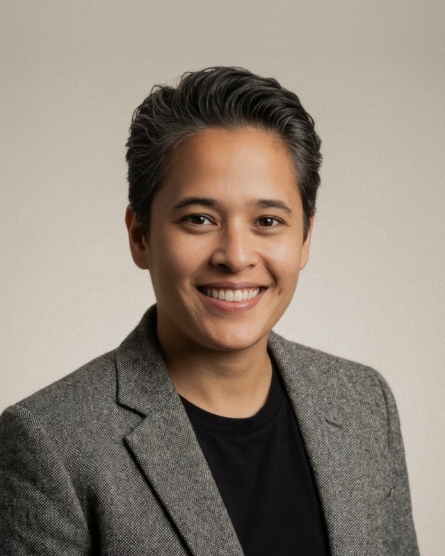
Portrait of Saidah van Lierop

Saidah van Lierop

Brand Designer & Strategist · The Netherlands

Portrait of Tiago R. Correia

Tiago R. Correia

Lead Architect & Urban Planner · Portugal

Portrait of Adam Ritchie

Adam Ritchie

Business Strategist & Creative Lead

Let’s begin the conversation

Let your vision bloom.

Every space begins as potential.
Every brand begins as a seed.
Let us help yours bloom.